One must be careful with statistics. One never knows what they are apt to say. Sometimes they say so many different things, it makes one’s head spin all around, trying to make sense of charts and tables and the endless data. I pity the robots and AIs, they really have their work cut out, it’s liable to make them crazy.
Here’s where I stumble on some reconciliation challenges, for instance. The fault is mine, no doubt, I haven’t seen the underlying calcs and metrics. And so I’m flying blind, or at least blurry eyed, like many of us far above the ground on autopilot.
Now, if my math is right, the big bars of this table add up to roughly 42 million (not counting the little bars immediately prior, which maybe didn’t find a job just as the big bars started)…

… so you would think that most of them, all things these days considered, have not been able to return to work so very swiftly, with the economy just barely out of lockdown, if at all. And then we have the following, which tells a different story still…
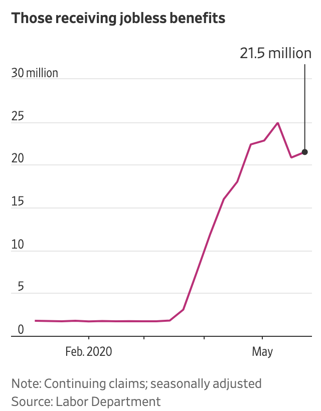
… which may imply that roughly half of 42+ million filers didn’t yet get approved by the system? It’s been a short time after all, and these things aren’t automatic. But even so, how is the dip from 25 to 21 explained while all the new claims bars remain so big and positive? I don’t know, maybe it’s the “seasonal adjustment”? Because it’s summertime, when the living is easy?
And then comes yesterday’s big headline, which sends another signal still… at the headline level at least, and, for purposes of zig-zagged pattern recognition in this post, especially the second little line with reference to millions…

Well alright then, there is a rise of 2.5, a corresponding change of 4 – to 21 from 25 – which differs from the 42 and counting… Again, it’s me, I know, I’m mindful of my limitations, I’m only as good as the headlines and the news reports (and probably much less), but honestly, it’s not for lack of trying.
Sometimes I even sift through all the details down below, here goes…


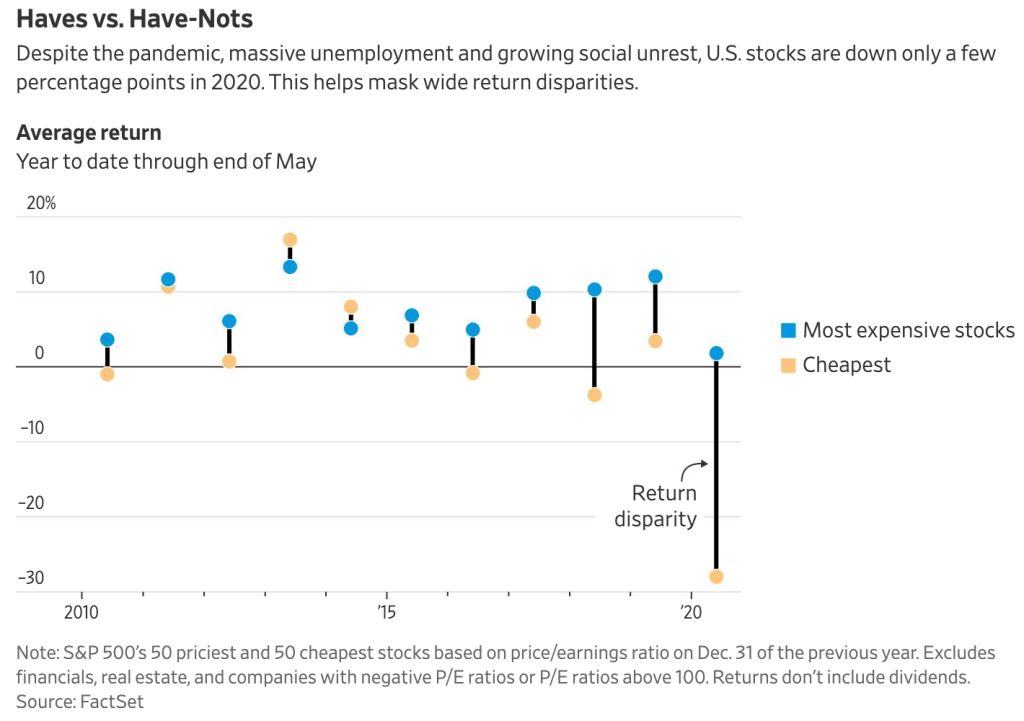
The problem though with all of the percentage charts is that these relate only to themselves, and so the detail is to some extent illusive; we still don’t know the impact of each sub-component on the total of the tens of millions… before digging further still, as some economists have tried.

I don’t know, I just don’t know… but take some solace in the notion that the market does. We’re in a bull market! Clearly.